-
2020
MDF, acrylic, plywood, and image projector
47”l x 11”w x 39”h
-
Rhino, Grasshopper, laser cutter, projection mapping
-
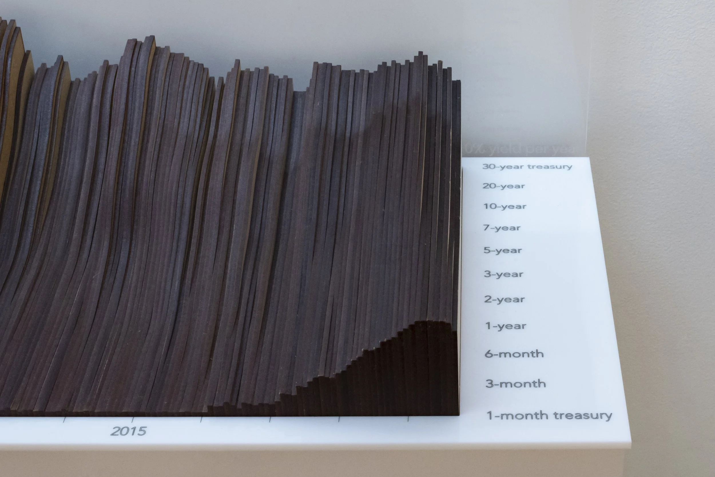
This object brings a dataset into the physical realm, allowing viewers to interact with the data in a different medium and dimensionality. Shown here is the yield curve, typically viewed in 2-dimensional or digital space. By portraying it 3-dimensionally, viewers understand the dataset in a new context, seeing patterns less visible than in a series of 2-dimensional graphs. Projection mapping allows an addition dataset to be incorporated into the object.
This exhibit is on permanent display at the Pratt Institute Manhattan Campus.
The yield curve is the difference between interest rates of short-term (1 month) United States government treasury bonds, and long-term bonds (up to 30 years). Typically, when an economy is in good health, the rate on the longer-term bonds will be higher than short-term ones. However, as these two figures draw closer, the curve flattens, or an even worst-case scenario, become inverted (i.e. the short-term rates are higher than the long-term rates).
Every recession of the past 60 years has been preceded by an inverted yield curve. Many of these recessions are observed here, including the Savings and Loan Crisis in the early 1990s, the burst of the “dot-com bubble” in 2001, and the Great Recession from 2008 to 2009.
Recently, flattening trends have been observed in the yield curve, causing some to wonder if the economic boom being currently observed may be threatened in the coming months or years. An important caveat to the predictive power of the yield curve is that it can’t predict precisely when a recession will begin. In the past, the recession has come in as little as six months, or as long as two years after the inversion.